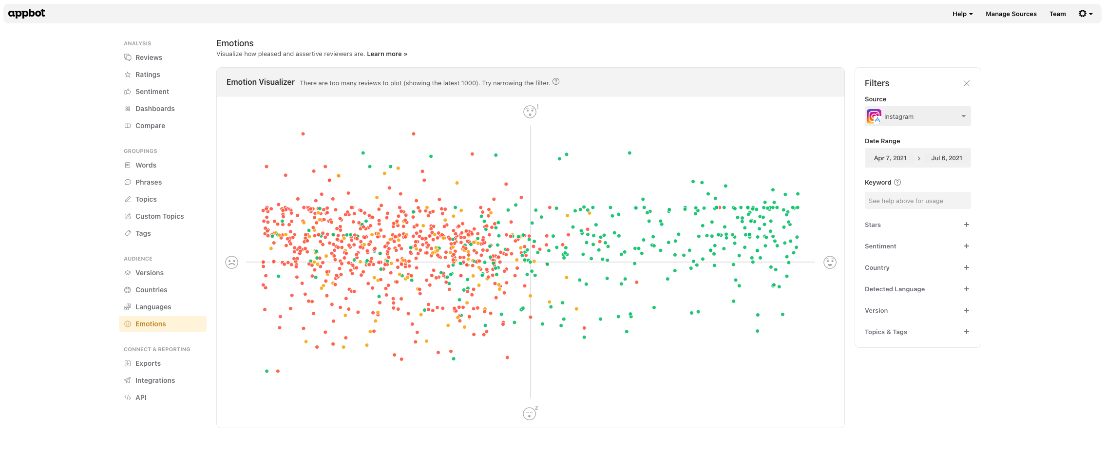
Appbot’s Emotions tool plots your app reviews to help you see patterns in how your customers are reacting to your app and quickly identify outliers that may require urgent attention. Each review is represented by a spot and is color-coded for sentiment.
To get to Emotions, click on Emotions from the main navigation.
 Every dot on the chart has a color that indicates the sentiment of that particular review. Green indicates positive sentiment, orange indicates neutral and red indicates negative sentiment.
X-axis: Pleased vs Displeased
The X-axis shows how pleased vs displeased a user appears to be. Most pleased users will be at the far right, neutral users in the center, and most displeased users at the far left.
Y-axis: Assertive vs Passive
The Y-axis shows how strongly users feel about the comments they’re making about your app. Users who feel strongly about what they are saying will appear at the Assertive end of the axis. Indifferent users will appear at the Passive end.
It’s less common for users to leave a review if they don’t feel strongly about their experience, so it’s not unusual for most of your reviews to be on the Assertive end of the scale.
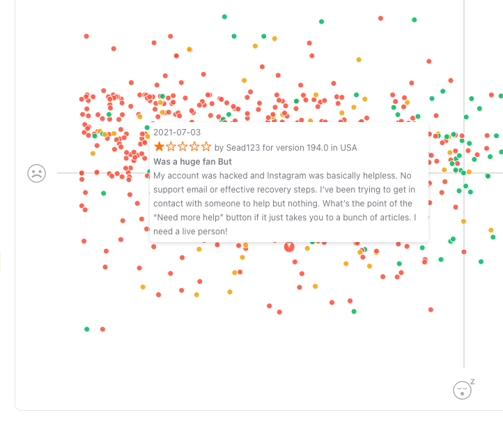
Hovering over any of the dots will display the specific review it relates to.
You can change the filters on the right of the page to only plot reviews from a particular:
- time period,
- keyword,
- star rating,
- sentiment score,
- country (iOS only),
- language,
- version (iOS only)
- whether or not a review has been replied to (Google Play only) and,
- custom topics and tags.
Ideally, you want to see:
- more dots in the top right quadrant,
- more green dots than orange or red and
- fewer outliers in either of the left or the bottom right quadrant.
If you need any further assistance, don’t hesitate to contact us with any questions or check out our FAQ section here.

